Gantt charts in project management: A complete guide for modern delivery teams

•
•
Summarize blog with






A Gantt chart is one of the most widely used tools in project management - and one of the most frustrating to keep accurate once work actually starts.
On paper, it looks simple: a timeline of tasks, dependencies, and milestones laid out across a calendar. But the moment real delivery begins, the chart starts drifting from reality. A customer delays a kickoff by two weeks.
A key consultant gets pulled onto a higher-priority account. A dependency slips, and forty-seven downstream tasks need to shift. By Friday afternoon, the "source of truth" is a week out of date, and your project managers are back in a spreadsheet recalculating dates by hand.
For professional services and delivery teams running 20 to 100+ concurrent projects, this isn't just a planning headache. It shows up directly in the numbers that matter: time-to-value, billable utilization, project margin, baseline variance, and customer satisfaction scores at renewal.
The real problem isn't building a Gantt chart. Most teams can do that in Smartsheet or Excel in an afternoon.
The real problem is keeping the Gantt chart connected to what's actually happening - to resource availability, to customer commitments, to dependency changes, to baselines you set at kickoff - without turning timeline maintenance into a full-time job.
This guide is built for delivery leaders and project managers who are past the basics. It covers:
- What a Gantt chart is, and what its core components actually do
- How to create one that holds up when reality diverges from the plan
- Why most teams silently fail at Gantt chart management - and what separates them from the teams who don't
- How modern delivery organizations are treating Gantt charts as live execution systems, not static planning artifacts
- What to look for when you're evaluating a move off spreadsheets or a legacy PSA
If your timeline lives in five different tools, gets stale between weekly status calls, and only tells you a project is at risk after it already is - this guide is for you.
Gantt chart definition
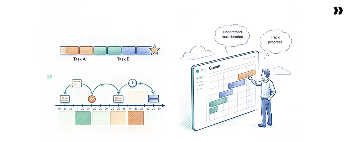
A Gantt chart is a type of bar chart that uses horizontal bars to visualize the project timeline and plan, showing all the tasks involved. The key elements of a Gantt chart include the timeline, task list, dependencies, and progress tracking.
Tasks and activities are listed vertically on the left side of a Gantt chart, while their durations are represented by horizontal bars across the timeline.
When teams treat the Gantt chart as a live operating model, not a one-time artifact built at kickoff, decisions stay grounded in the same picture across the entire project. When it is rebuilt every time someone asks for an update, decisions get made on stale data.
Core components of a Gantt chart
- The task list includes all project tasks to be completed, often derived from a work breakdown structure to ensure clear organization and prevent scope creep.
- The timeline shows when project tasks are scheduled.
- Task bars visually represent the duration of each task along the timeline, allowing for easy adjustment and tracking.
- Task sequence and task relationships (dependencies) are visually mapped to show how tasks connect and affect one another.
- Dependencies link tasks together, clarifying which tasks must be completed before others can begin.
- Milestones highlight key checkpoints and deliverables within the project.
- Progress indicators show the completion status of each task for effective tracking.
How to interpret a Gantt chart
- Bars represent how long each task takes, forming the core of the Gantt chart format and providing a visual timeline of the project schedule.
- The vertical axis lists tasks or phases, allowing teams to track tasks and monitor progress throughout the project.
- The horizontal axis shows time, helping estimate task durations for accurate scheduling.
- Arrows indicate dependencies between tasks.
- Milestones mark critical events like approvals or go-live.
- Progress shading shows how much work is complete, making it easy to monitor progress at a glance.
- A vertical “today” line shows the current project position.
For a customer onboarding project, discovery feeds into design, design feeds into configuration, and configuration feeds into testing. When a customer pushes a discovery workshop back by a week, every downstream task should shift accordingly.
Business Impact
A well-built Gantt chart answers three questions every delivery leader asks during the week: what is on the critical path, who is over-allocated against capacity, and which milestones are tracking against baseline.
When those answers are in one view, decisions are made in minutes instead of in meetings. When they live across four tools, the answer is always "let me get back to you on that," and the window to course-correct has already closed.
Decision speed compounds across a portfolio. A PM who can model the downstream impact of a slipped dependency in real time avoids the two-week escalation that was already coming.
A delivery leader who sees capacity against scheduled work makes the staffing call before a senior consultant is double-booked.
The pattern shows up in the numbers that matter: billable utilization above 70%, time-to-value reduced by weeks, and fewer renewal conversations that open with "the project did not go well."
Why Gantt charts still matter for modern delivery teams

Gantt charts remain essential because delivery work is interconnected. A delay in one task ripples across the project, and without a shared timeline, teams find those ripples too late to course correct.
For PS teams running 20 to 100+ concurrent projects, the Gantt chart connects today’s work to the contracted go-live.
- Dependency visibility: A Gantt view exposes which tasks block downstream work and where the critical path runs. It surfaces schedule risk weeks before a status meeting would catch it.
- Cross-team and customer alignment: When implementation, sales, customer success, and the customer all see the same timeline, ownership becomes specific. Customers treat their tasks as commitments, reducing the “waiting on the customer” delays that erode fixed-fee margin.
- Milestone clarity for forecasting: Knowing when phases close keeps revenue, capacity, and renewal forecasts grounded in actual delivery data instead of gut feel.
- Alignment and forecasting: Gantt charts enable teams to track project progress and status visually, making it easier to assess overall health and advancement.
- Variance detection against baseline: Comparing the current schedule to the original plan shows whether delays are scope-driven, resource-driven, or customer-driven. That distinction is the difference between a hard conversation and an avoidable escalation.
Gantt charts also help communicate progress to stakeholders and keep teams focused by supporting workload management, ensuring everyone is aligned, and efficiently allocating resources.
Without a timeline view, teams operate reactively instead of proactively. The cost shows up in missed deadlines, eroded margins, and delayed time-to-value.
Why most teams fail with Gantt charts
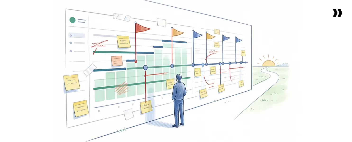
Most teams don’t fail because Gantt charts are flawed. They fail because of how Gantt charts are used.
Four patterns show up across PS teams that have outgrown spreadsheet-based planning:
- Static timelines that don’t reflect real-world changes: The plan built in week one stops matching reality by week four. Customer delays, scope changes, and resource shifts occur continuously, but the chart updates only when someone forces a manual sync.
- Resource planning that lives in a separate tool: Project timelines sit in Smartsheet or a PSA, while resource allocation lives in a spreadsheet that is owned by one person. The two never reconcile, so PMs schedule work against a nonexistent capacity.
- Baselines overwritten instead of tracked: Teams update the live plan and lose the original. When a customer asks why a 90-day project is now 130 days, no one can show what changed.
- Manual, time-consuming reporting: Status updates require pulling data from three or four systems, formatting it in slides, and emailing it weekly. Senior PMs spend 20 to 30 percent of their week on administrative work rather than on customer outcomes. Gantt charts can reduce the need for detailed reports by providing a clear visual overview of project status, allowing stakeholders to quickly understand progress without reviewing extensive documentation.
The result: a tool that should drive execution becomes a reporting burden. The cost shows up in margin erosion and customer dissatisfaction.
How to create a Gantt chart that actually works
The seven steps to create Gantt charts that hold up in delivery are: define scope, break down work, estimate durations, map dependencies, assign tasks to team members, schedule tasks along the timeline, allocate resources efficiently, set a baseline, and track continuously.
Teams can create Gantt charts using project management software or other tools, and integrating them into broader project management solutions enhances scheduling and resource allocation.
Step-by-step process
- Define the project scope and phases: Start with the contracted outcome, outline key deliverables, and identify the major phases required to achieve it. For a SaaS implementation, this typically means discovery, design, configuration, validation, training, and go-live.
- Break the work into tasks and milestones: Decompose each phase into all the tasks and individual tasks required for the project, ensuring every activity is identified and organized. A useful rule: no task should take longer than two weeks.
- Estimate realistic durations: Account for effort, calendar duration, and customer response time. A 40-hour task can span two weeks if the consultant is at 50% allocation. Build in buffers where customer input is required.
- Add dependencies: Map dependencies by identifying dependent tasks and understanding which tasks rely on others to determine the correct sequence. Define which tasks must finish before others start (finish-to-start), which run in parallel (start-to-start), and where lead or lag applies. This enables critical path analysis and accurate downstream impact modeling.
- Assign resources and owners: Every task needs a named owner and a resource allocation. This is where Gantt charts and resource management connect. A timeline with no resource view will over-allocate to someone every time.
- Set a baseline: Save the original plan before execution starts. Without a baseline, you cannot answer “what changed and why” later in the project.
- Track and update continuously: Update task status, actual dates, and remaining effort as work happens. The Gantt chart should reflect this week’s reality, not last quarter’s plan.
Tools to create a Gantt chart
- Excel and Google Sheets: Widely used for basic planning, but limited in dependency tracking, baseline comparison, and multi-project visibility. You can create a Gantt chart in Excel using built-in charting tools, like stacked bar charts, or by using free Gantt chart templates available online.
- General project management tools: Asana, Monday, and ClickUp offer more structure but still treat resource planning as a separate problem.
- Dedicated Gantt chart software: Enables dependency logic, baseline tracking, and critical path automation.
- AI-powered PSA platforms: Generate plans from scope documents, optimize timelines, and adjust dependencies as conditions change.
Free Gantt chart maker tools and Gantt chart templates are available online for various industries, including construction schedules and event planners, making it easy to organize and visualize project timelines for different professional needs.
Example: customer onboarding timeline
A typical SaaS customer onboarding follows a clean sequence: discovery → design → configuration → validation → go-live.
Each stage depends on the previous one. A two-week customer delay in discovery shifts every downstream task by two weeks. That cascade is what dependency-aware Gantt charts are built to manage.
Gantt chart examples (with explanation)
Three Gantt chart patterns cover most professional services scenarios: simple linear projects, complex multi-track implementations, and customer-driven onboarding timelines.
Gantt charts are especially valuable for managing complex projects with multiple dependencies, as they provide a clear visualization of the entire project life cycle—from initiation to completion—helping teams track tasks, milestones, and dependencies across all phases.
1. Simple project Gantt chart
A marketing campaign launch is the cleanest example. Phases run roughly in sequence: brief → creative → review → production → launch → measurement.
Dependencies are mostly finish-to-start. Resources stay within one team. Customer-side blockers are minimal.
A simple Gantt chart works well here because the work is predictable and the team controls most variables. Excel or a basic project management tool can handle it without strain.
2. Complex implementation Gantt chart
An enterprise SaaS implementation is the opposite. The project runs 90 to 180 days and spans five or more phases. Workstreams run in parallel: data migration, integration setup, configuration, training, and UAT.
Gantt charts are also widely used in construction project management to organize tasks, dependencies, and schedules, ensuring efficient coordination and timely completion.
This is where dependency logic earns its place. A delay in data migration can delay integration testing, which delays UAT, which delays go-live. Critical path analysis shows which slip days move the deadline and which get absorbed.
Resource planning also gets harder. Solution architects, data engineers, and integration specialists all share allocation across multiple active accounts. Without a connected view of timeline and capacity, double-booking is guaranteed.
3. Customer onboarding Gantt chart
Customer onboarding is the most dynamic of the three. The plan includes internal tasks (configuration, training preparation) and customer-driven tasks (data exports, stakeholder availability, sign-offs).
Customer-side delays cascade unpredictably. A discovery workshop pushed by a week shifts every dependent task downstream. The Gantt chart for an onboarding project must be updated continuously and surface risks early. It also needs to give the customer a view of their own commitments.
This is the scenario where static Gantt charts break down hardest. The maintenance overhead grows with every active account. The cost of getting it wrong shows up in time-to-value, churn risk, and renewal exposure.
Advantages and disadvantages of Gantt charts
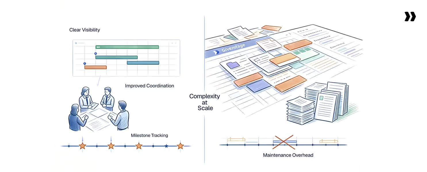
Gantt charts compound across delivery when they are kept current and integrated, helping teams manage projects efficiently. When used alongside project management software, Gantt charts enable better workload balancing, task list management, and team collaboration.
However, they become a maintenance burden when they are not kept up to date.
Advantages of Gantt charts
- Clear timeline visibility: A single view shows what is happening, when, and what depends on what. It replaces scattered status emails with one shared picture.
- Improved coordination across teams: When implementation, sales, customer success, and the customer all see the same plan, ownership becomes specific. Handoffs get cleaner.
- Better milestone and deadline tracking: Phase closures, approvals, and go-live dates are visible. Slips show three weeks out, not three days.
- Stronger forecasting: Knowing when work happens makes capacity, revenue, and renewal forecasts grounded in delivery data, not gut feel.
- Defensible variance reporting: Baseline comparison shows what changed and why. It protects margins on fixed-fee projects and reduces noise around escalation.
Disadvantages of Gantt charts
- Complexity at scale:
Why it happens: A Gantt chart with 200+ tasks and parallel workstreams becomes hard to read and harder to maintain.
Fix: Use phase-level views by default and let teams expand into task-level detail only when needed. - Maintenance overhead:
Why it happens: When the Gantt chart lives in one tool, and the actual work happens in another, every update is manual.
Fix: Build the chart in a system where time tracking, resource allocation, and customer interactions already flow. - Rigidity in fast-changing environments:
Why it happens: Static Gantt charts assume the plan stays close to reality. Agile or research-style work breaks that assumption.
Fix: Use Gantt for high-level milestone planning and Kanban or sprint boards for the day-to-day flow. - Limited customer visibility:
Why it happens: Most Gantt tools were built for internal teams, with no clean way to share a filtered view externally.
Fix: Choose a platform with native customer portal capability so timelines stay in sync without manual exports.
Left unaddressed, these disadvantages compound. Each one adds hours per project per week, and the cost scales with portfolio size.
Gantt chart flowchart for customer onboarding
Most SaaS customer onboarding projects follow the same ten-stage flow. Mapping it as a Gantt chart from day one gives every stakeholder a shared view of the sequence and ownership.
Structured stages
- Contract handoff: Sales transfers signed contract details, customer commitments, and key contacts to the implementation team.
- Internal kickoff: Implementation, customer success, and any technical resources align on scope, timeline, and risks before customer engagement.
- Customer kickoff: Formal start of the project with the customer. Roles, milestones, communication cadence, and success criteria have been agreed upon.
- Discovery: Workshops to understand the customer's current state, requirements, and integrations.
- Design: Solution design, configuration plan, and integration architecture documented and approved.
- Configuration: Build the customer instance: settings, fields, workflows, and integrations.
- Validation: Testing and UAT against the agreed design, with customer sign-off on each test cycle.
- Training: End-user and admin training, knowledge transfer, and documentation handover.
- Go-live: Production cutover, with go-live support and incident response on standby.
- Hypercare: Two to four weeks of heightened support after go-live to catch and resolve early issues.
Copyable template
Contract → Kickoff → Discovery → Design → Build → Validate → Train → Go-live → Hypercare
This sequence works as a starting Gantt template for most B2B SaaS implementations. Adjust phase length based on contract size and complexity. A 30-day SMB onboarding might compress discovery and design into a single week. A 120-day enterprise implementation may run them as parallel workstreams over two months.
Full Gantt-ready template
What best-in-class teams do differently
The teams that get the most out of Gantt charts treat them as a system, not a document. The Modern Gantt Maturity Model maps the three levels PS teams move through as delivery operations mature.
The Modern Gantt Maturity Model
The Modern Gantt Maturity Model is a three-level framework. It moves a Gantt chart from a planning artifact to a live delivery operating system. Each level builds on the one before it, and skipping a level creates a predictable failure mode downstream.
Level 1: Static planning
The plan is built in week one in Smartsheet, Excel, or a project management tool. Tasks, dependencies, and milestones are defined and shared. Updates happen manually only when something escalates, so the chart becomes a snapshot.
Level 2: Connected execution
The Gantt chart is built into a system that integrates with live resource allocation, time tracking, and customer-side task ownership. When a dependency slips, downstream work shifts and resource conflicts surface the same day. Status meetings are shortened because everyone sees the same updated picture.
Level 3: Intelligent delivery with AI and automation.
AI watches the project against historical patterns and surface risks before they escalate. Routine plan updates, status documentation, and dependency adjustments are automated. PMs spend their time on customer outcomes, not administrative work.
Skipping Level 2 is the most common failure. Teams jump from static planning straight to AI, and the AI has no real data. The model needs connected execution data first, which is why the levels are sequential rather than optional.
Dependency management, critical path, and baseline variance
These three concepts separate teams that hit deadlines from teams that constantly explain why they did not. Understanding task relationships and task sequence is essential for accurate dependency management, as many tasks rely on the completion of others. Used together, they turn a Gantt chart from a static visual into a decision-making tool.
Dependency management
Dependencies define the sequence of work. They define which tasks must finish before others start, which run in parallel, and which tasks lead or lag.
The four dependency types matter:
- Finish-to-start (FS): The default. Task B starts after Task A finishes. Most onboarding work follows this pattern.
- Start-to-start (SS): Task B starts when Task A starts. Useful for parallel workstreams in complex implementations.
- Finish-to-finish (FF): Task B finishes when Task A finishes. Common for testing and documentation that wrap together.
- Start-to-finish (SF): Rare. Used in shift-style handoffs.
A strong dependency setup pays off when something slips. Instead of manually recalculating ripple effects across 47 tasks, the chart automatically shifts work downstream. The new risk picture surfaces the same day.
Critical path
The critical path identifies tasks that drive the final deadline. Slip a critical path task by one day, and the project deadline moves by one day. Slip a non-critical task, and the slack absorbs the impact.
Most teams do not filter their Gantt chart to the critical path during status reviews. They drown in non-critical noise and miss the tasks that drive the deadline. Strong PS teams check the critical path weekly and adjust resourcing to protect it.
Baseline variance
Baseline variance shows how actual timelines differ from the original plan. Without it, "the project is running 30 days late" is a fact with no explanation.
A baseline saved at kickoff lets PMs answer the harder question: what changed? Was it scope additions? Customer delays? Internal resource constraints? That breakdown protects margins on fixed-fee projects and makes change-order conversations defensible rather than awkward.
Resource allocation and Gantt charts
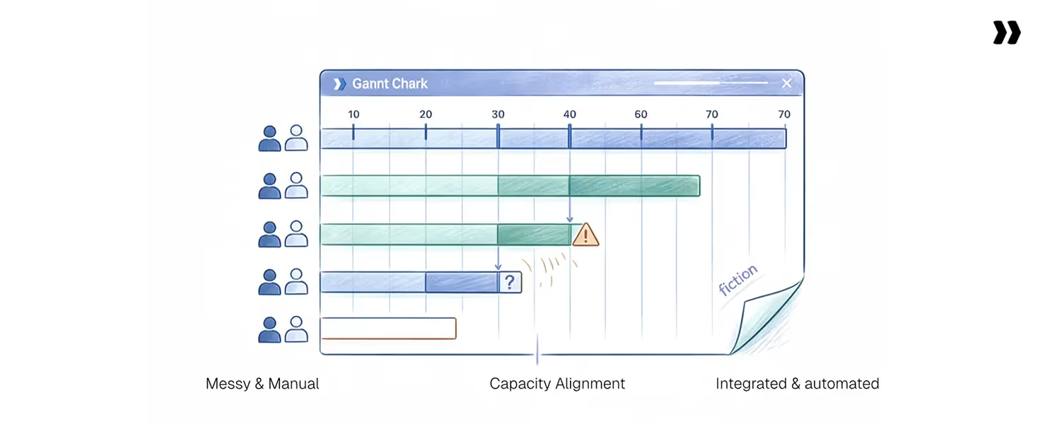
A Gantt chart without resource visibility is a wish list. The timeline shows when work should happen. It says nothing about whether the people doing the work are available.
This disconnect is why PS teams either burn out their best consultants or leave billable capacity on the table.
Effort and duration are different
Effort is hours of work. Duration is the calendar time that work spans. A 40-hour task does not mean two weeks for one person at 100%. It might mean four weeks for one person at 50% allocation, or one week for two people at 50% each.
Confusing effort with duration is the most common error in Gantt chart estimation. Tasks look fine on the timeline and impossible on the resource sheet.
Capacity must align with scheduling
A timeline that ignores capacity creates conflicts you discover the week of a milestone, not in advance. Strong PS teams check three things together:
- Allocation: Who is assigned to what, at what percentage
- Capacity: Who has time available, accounting for PTO, holidays, and existing work
- Skill match: Who has the skills the task requires
When all three live in a single system, the Gantt chart becomes a real plan rather than an aspirational one.
Resource visibility prevents over-allocation and under-utilization
Over-allocation burns out delivery teams and degrades quality. Under-utilization leaves margin on the table. Most teams swing between the two because they cannot see the allocation in real time.
A resource heat map, paired with the Gantt chart, shows who is over 100%, at target, or underutilized. Acting on those signals weekly is what sustains 70 to 85% billable utilization without breaking the team.
Traditional vs modern Gantt charts
The difference between traditional and modern Gantt charts is not the visual format. It is whether the chart updates itself or whether someone updates it.
Traditional Gantt charts assume the plan is built once and adjusted manually. Modern Gantt charts assume that reality changes continuously and that the chart should reflect that without human intervention.
As a project evolves, modern Gantt charts allow for dynamic updates and adjustments to reflect real-time changes, ensuring the plan stays accurate and relevant.
The shift matters because manual maintenance scales linearly with project count, while delivery teams stay flat.
A team handling 20 projects on a traditional Gantt cannot scale to 60 without doubling headcount. The alternative is accepting quality decline.
Modern Gantt charts are not a feature upgrade. They are an operational requirement for any PS team trying to grow without losing margin.
Gantt chart vs timeline, Kanban, and PERT
Gantt charts are a powerful visual representation of project schedules, illustrating task sequences, durations, and dependencies to help identify issues and manage projects effectively. However, other project management tools may be better suited for different types of work.
Gantt charts get compared to three other planning formats: timelines, Kanban boards, and PERT charts. Each fits a different kind of work, and using the wrong one creates predictable failure modes.
Gantt vs timeline
A timeline shows what happens when. A Gantt chart shows what happens when, in what sequence, with what dependencies, and against which baseline. Timelines work for board decks. Gantt charts work for delivery.
Gantt vs Kanban
A Gantt chart organizes work by time and dependency. A Kanban board organizes work by status and flow. PS teams running 60-day implementations need Gantt at the project level and Kanban inside phases for repeatable workstreams.
Gantt vs PERT
PERT focuses on dependency analysis using three-point estimates: optimistic, most likely, and pessimistic. Gantt focuses on visual scheduling and execution. PERT is an estimation tool. Gantt is a delivery tool. Strong PMs use PERT-style estimates to determine the durations for a Gantt chart.
KPIs that show whether your Gantt chart process is working

Five KPIs separate teams whose Gantt charts drive delivery from teams whose charts collect dust. Track them weekly. If three or more are trending the wrong way, the issue is not the people. It is the process.
- Schedule variance: The difference between baseline and actual dates, measured at the task and project level. Healthy projects sit within 10% of baseline. Variance above 25% signals a planning problem, an execution problem, or both.
- Milestone delays: Count of milestones missed against the original baseline. A team that misses more than one milestone per project, on average, has a dependency or capacity problem. Recurring slips on the same milestone type indicate a templating error in estimation.
- Time-to-value (TTV): Calendar days from contract signature to the customer's first measurable outcome. Strong PS teams reduce TTV by 30-50% through standardized phase templates and automated dependencies. TTV that grows quarter over quarter is the clearest leading indicator of churn risk.
- Billable utilization Percentage of consultant hours billed to customer projects: The healthy range for client-facing PS teams is 70 to 85%. Below 70% means revenue is leaking. An above-85 % sustained means the team is on the edge of burnout.
- Reporting effort: Hours per week spent creating status updates, reconciling timelines, and preparing executive reports. If senior PMs spend over 5 hours a week on reporting, the Gantt chart is not feeding the system.
Track these together, not in isolation. Schedule variance without utilization context is meaningless noise. Reporting effort without the TTV context misses the cost of slow delivery. The signal is in the pattern across all five.
Self-assessment: Is your Gantt approach breaking?
Five signals indicate that a Gantt approach has outgrown its tooling. Score yourself honestly. The more boxes you check, the higher the operational cost of staying where you are.
Check the points that apply to your team:
- Timelines require constant manual updates. Your PMs spend hours every week shifting tasks, recalculating dependencies, and reconciling resource conflicts in spreadsheets.
- Resource conflicts appear late. Allocation problems surface the week of a milestone. Senior consultants get double-booked, and you find out from the team, not the system.
- Customers need separate status updates. Your team builds custom slides or emails weekly because the project tool was not built to share externally.
- You cannot explain delays clearly. When a 90-day project runs 130 days, no one can explain the variance.
- Reporting eats senior PM time. More than 5 hours per PM per week go to status updates, executive reports, and reconciling data across tools.
What the scores mean
- 0 to 1 boxes checked: Your current approach is holding up. Watch for changes as project volume grows.
- 2 to 3 boxes checked: Operational drag is real; you are losing margin and PM time. Scope a better tool within two quarters.
- 4 to 5 boxes checked: The system is broken. Every month, maintaining it costs more in PM hours, missed deadlines, and customer satisfaction than switching would.
- If 4 or 5 hit you: The question is no longer whether to change the approach. It is how quickly you can.
Triggers that tell you it is time to upgrade
The self-assessment surfaces chronic pain. These triggers are different. They mark the acute moments where something breaks. The leader knows the current approach will not survive the next quarter.
1. Scaling project volume
You used to run 20 concurrent projects while keeping the spreadsheet alive. Now you are at 50 and growing toward 80. The admin function does not scale with project count.
2. Missed deadlines
A project you committed to at 90 days delivered at 130. A milestone the customer expected on Tuesday was pushed to the following Tuesday without warning. Once or twice is variance. A pattern is a process problem, and finance starts asking why the margin is shrinking.
3. Resource bottlenecks
Your best solution architects are over-allocated, and the bench is sitting idle. PTO requests get denied because no one can model the coverage impact. New deals close, and no system tells you whether you can staff them.
4. Customer dissatisfaction
As CSAT scores drop, renewal conversations get harder. Customers say things like "we never know where we are in the project." The implementation experience is no longer a selling point. It has become a liability.
When two or more triggers hit in the same quarter, the cost of staying compounds. Each missed deadline drags the margin. Each resource conflict burns a senior consultant. Each customer escalation puts a renewal at risk. That is when most teams move from research to evaluation.
How to evaluate Gantt chart software
The right Gantt chart tool reduces work, not adds to it. Five capability criteria separate modern delivery platforms from generic project management tools.
- Dynamic dependency management: Downstream tasks should adjust automatically when predecessors slip, with PM approval before applying changes.
- Native resource integration: The Gantt view should show allocation, capacity, and skill match alongside the timeline, not in a separate tool.
- Multi-baseline tracking: Save unlimited baselines with annotated change history, so variance is always explainable.
- Customer-facing portal: Customers should see filtered views of their timelines and their own commitments without requiring internal logins.
- CRM and time-tracking integration: Projects should kick off from closed deals and pull actuals from time entries to eliminate duplicate entries.
Watch out for tools that require constant configuration for basic dependency changes.
Charts that live separately from time tracking and resource management. "Gantt chart software" is a static visualization with no underlying logic.
Tools like Rocketlane connect Gantt timelines to live resource capacity and customer collaboration. It is an Agentic AI-powered PSA platform built for customer-facing professional services teams.
How Rocketlane modernizes Gantt charts
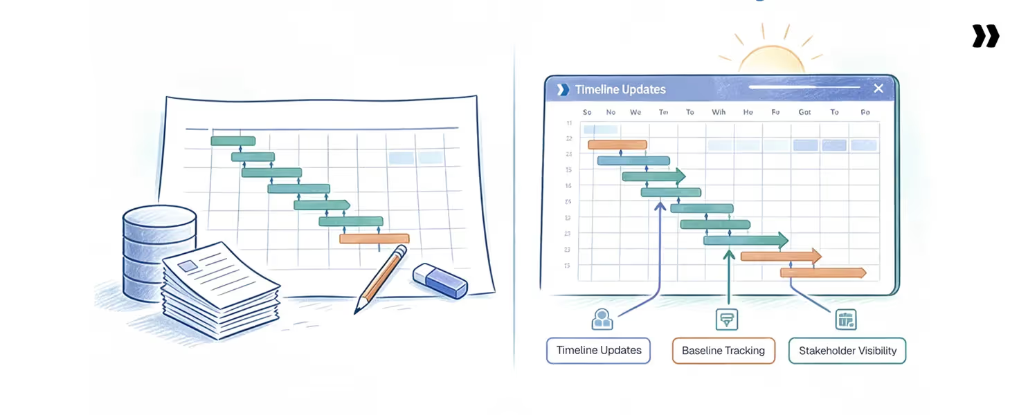
Most Gantt chart problems are not Gantt chart problems. They are integration problems. The timeline lives in one tool, capacity in another, customer commitments in a third, and every weekly sync is spent reconciling the three.
Rocketlane, an Agentic AI-powered PSA platform for customer-facing professional services teams, collapses those three systems into a single platform.
The Gantt chart becomes the operating layer where time tracking, dependencies, customer tasks, and resource availability all update the same picture. PS teams running delivery this way sustain 70 to 85% billable utilization across 20 to 100+ concurrent projects without adding headcount.
How Nitro changes the future of Gantt charts
Nitro is Rocketlane's AI layer built into the project delivery platform. It introduces three capabilities that change how Gantt charts get built, maintained, and acted on.
1. Automated planning
Nitro generates project plans from scope documents, contracts, and prior project templates. What used to take a PM hours of manual setup happens in minutes. Dependency logic, milestones, and resource roles pre-populate based on the scope.
2. Proactive risk detection
Nitro continuously analyzes project signals against historical patterns. When a critical-path task trends late or customer engagement drops, Nitro surfaces the risk before it becomes an escalation. PMs intervene days or weeks before a status meeting would catch it.
3. Timeline optimization
When a milestone slips, Nitro suggests the lowest-impact recovery options. Reallocating capacity, parallelizing tasks, and adjusting dependency types are all evaluated against current resource availability and historical delivery patterns. The PM still decides. Nitro does the analysis that used to take hours.
The shift is bigger than tooling. Project delivery shifts from human-paced, reactive work to system-paced, proactive work. Manual effort drops by 30-50%. PMs spend their time on customer outcomes, not administrative drag.
Conclusion
Gantt charts are not the problem. The way most teams maintain them is. A chart built in week one and updated by hand drifts from reality by week four, and every hour a senior PM spends reconciling timelines is an hour not spent on customer outcomes.
At 20 projects, this is a margin tax. At 80, it is a ceiling on growth.
The teams clearing that ceiling treat the Gantt chart as a live system connected to resources, dependencies, and customer commitments.
The rest keep rebuilding the plan every Friday and wondering why delivery predictability keeps slipping.
Timeline slip is not a planning problem. It is a visibility problem that shows up weeks after the decision that caused it. Rocketlane connects Gantt timelines to live resource capacity and customer collaboration, enabling PS teams to sustain 70 to 85% billable utilization without doubling headcount.
See how Rocketlane builds Gantt charts into live delivery
Table of Contents

Regsiter for the live webinar


Great consultants didn't join your team to spend Fridays writing documentation.
Table of contents
18 of Forbes Cloud 100 chose Rocketlane. The best PS teams aren't waiting around.
FAQs
What is a Gantt chart?
A Gantt chart is a visual project management tool that displays tasks along a timeline, showing start and end dates, task dependencies, milestones, and progress. It allows teams to plan, schedule, and track work in a structured, time-based format.
When should you use a Gantt chart?
Use a Gantt chart for structured, multi-phase projects with deadlines, dependencies, and clear handoffs. It is the right tool for client-facing professional services work like SaaS implementations, system integrations, and customer onboarding.
What are the advantages of a Gantt chart?
Gantt charts give teams clear timeline visibility, dependency awareness, milestone tracking, and a shared view across stakeholders. Done well, they reduce status-meeting overhead and make schedule risk visible weeks before it becomes an escalation.
What are the disadvantages of a Gantt chart?
Gantt charts can become hard to maintain at scale, especially when timelines, resources, and customer commitments live in separate tools. Static charts also struggle in fast-changing environments. Modern Gantt tools rely on automation and AI to reduce manual upkeep.
What is the difference between a Gantt chart and a Kanban board?
A Gantt chart organizes work by time, sequence, and dependencies, making it ideal for projects with deadlines and handoffs. A Kanban board organizes work by status and flow. It is better suited to continuous, repeatable work without a fixed end date.













Copyright © 2026 Rocketlane Corp. All rights reserved.
















.webp)